OneMauve is a mentoring platform that offers a comprehensive software solution aimed at empowering organisations to strengthen their pipeline programs through effective mentorship.
“We need a total revamp of our Mentoring Web App and the landing page, users are not engaging and often complain of navigation issues among others, tedious booking and consultation scheduling, inability to measure performance for both mentors and mentees overtime”.
These are the issues the company aim to solve with the redesign of the entire app and its landing page to drive conversion.
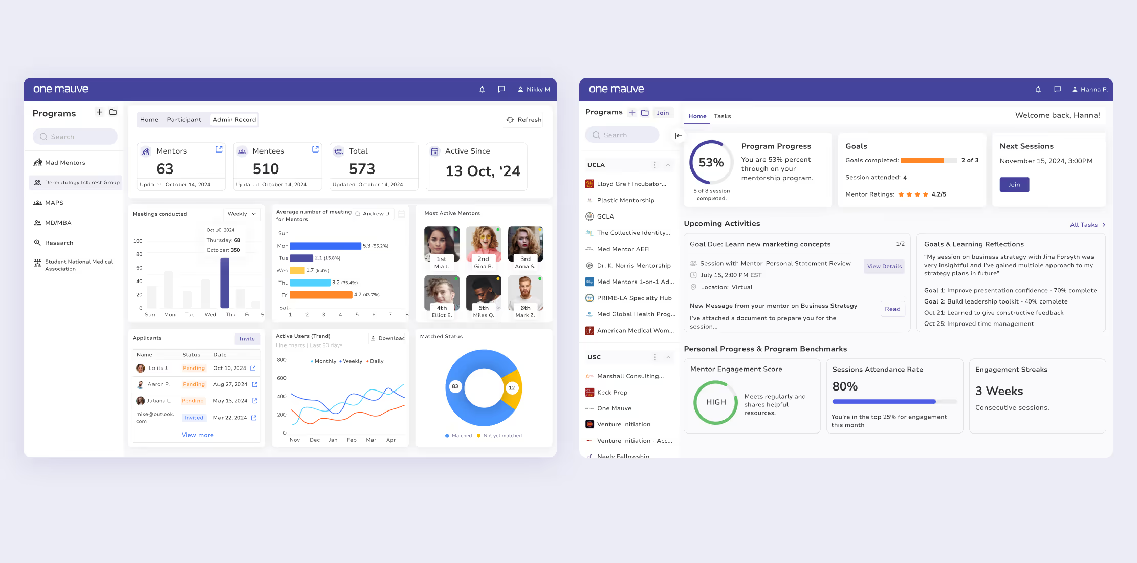
The solution was the transformation of the entire platform, we added additional pages (dashboard and mentees evaluation metrics, which will help companies and individuals to:
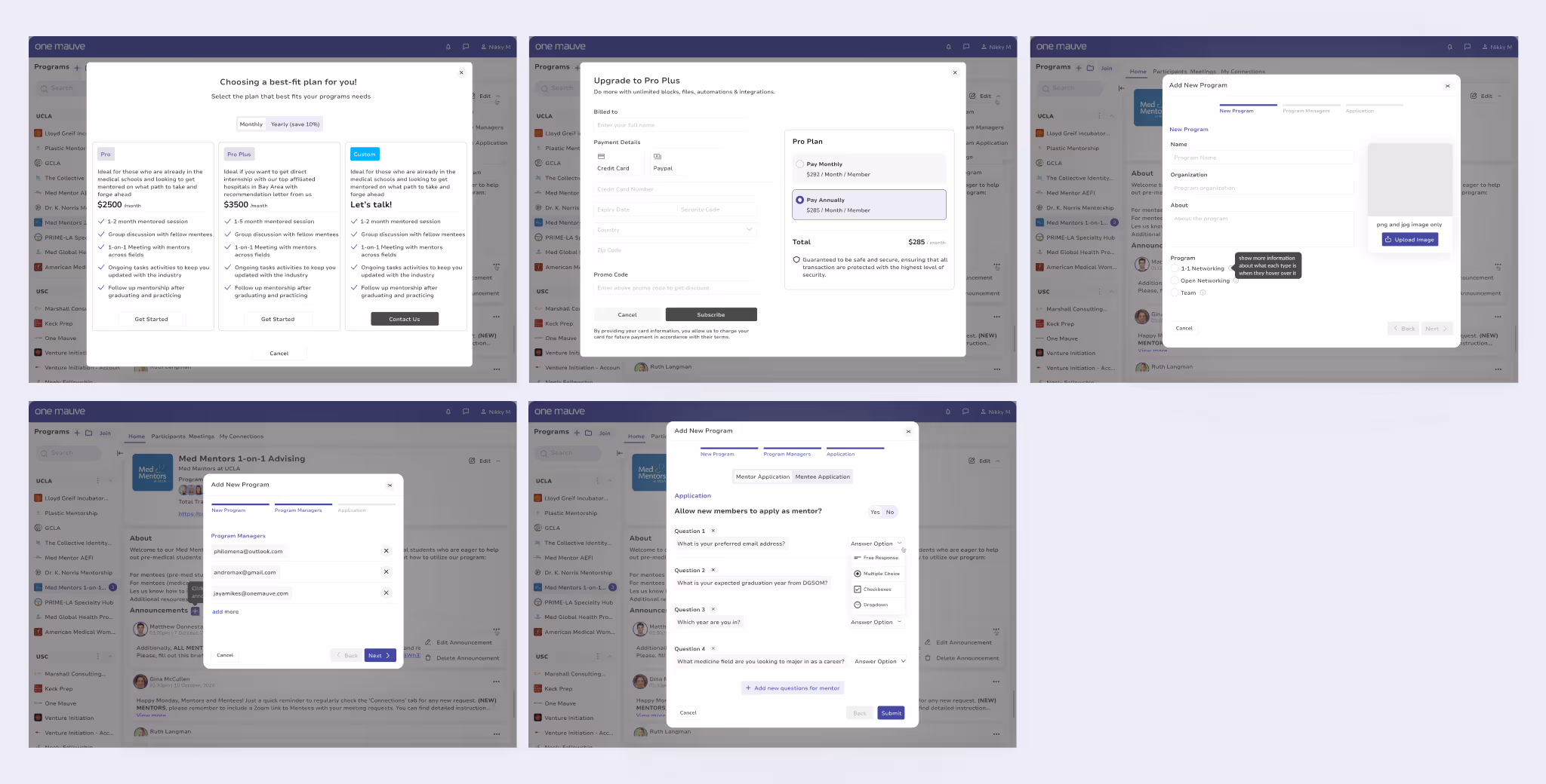
Also, we introduced premium subscription feature for businesses.
We ensured we had full understanding of the platform as it was before I started discussions, process and interviews with the product owner about the business objectives.
“Onemauve major purpose is to help businesses, scientists, doctors and others in the STEM space get mentoring in their field from seasoned professionals and consultants about their career path, while helping organizations strengthen their pipeline programs through effective mentorship”.
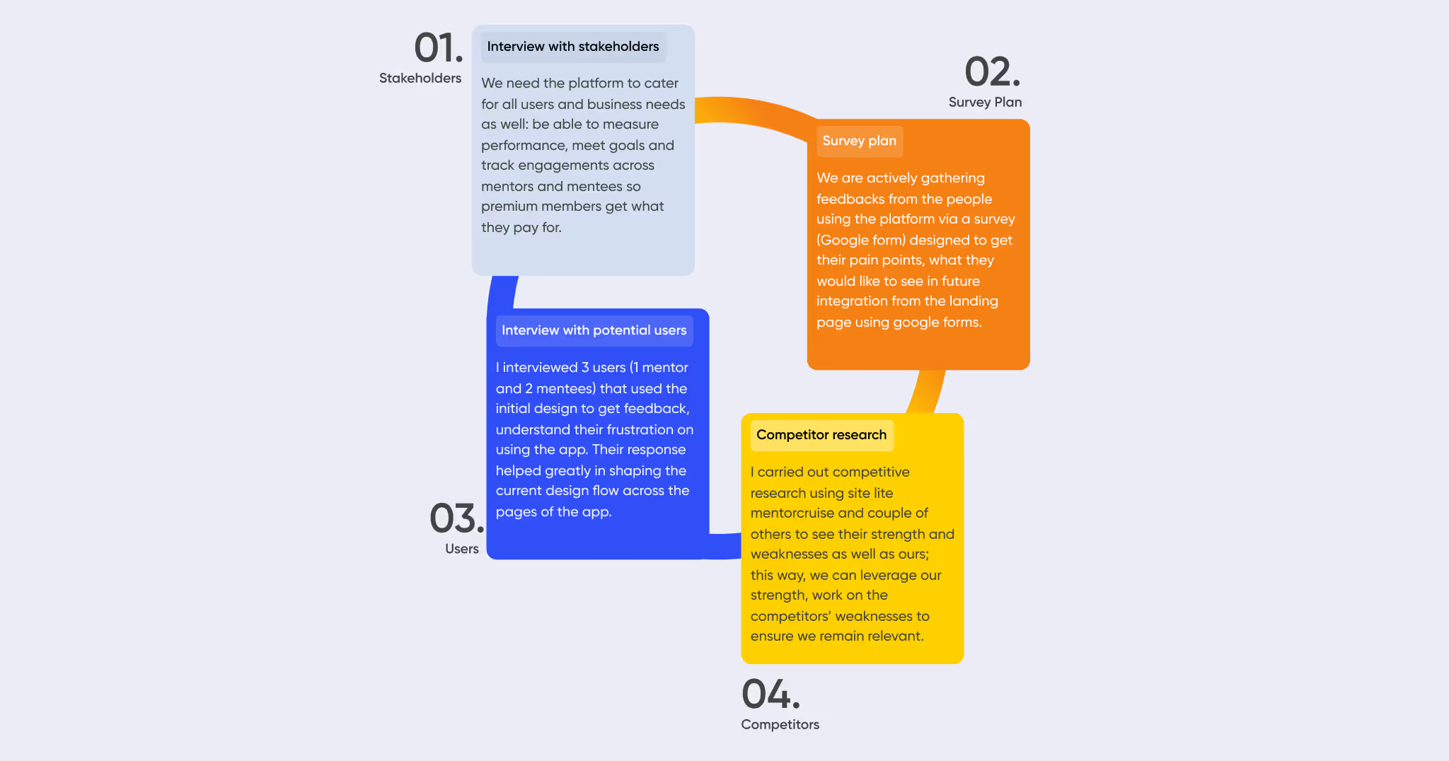
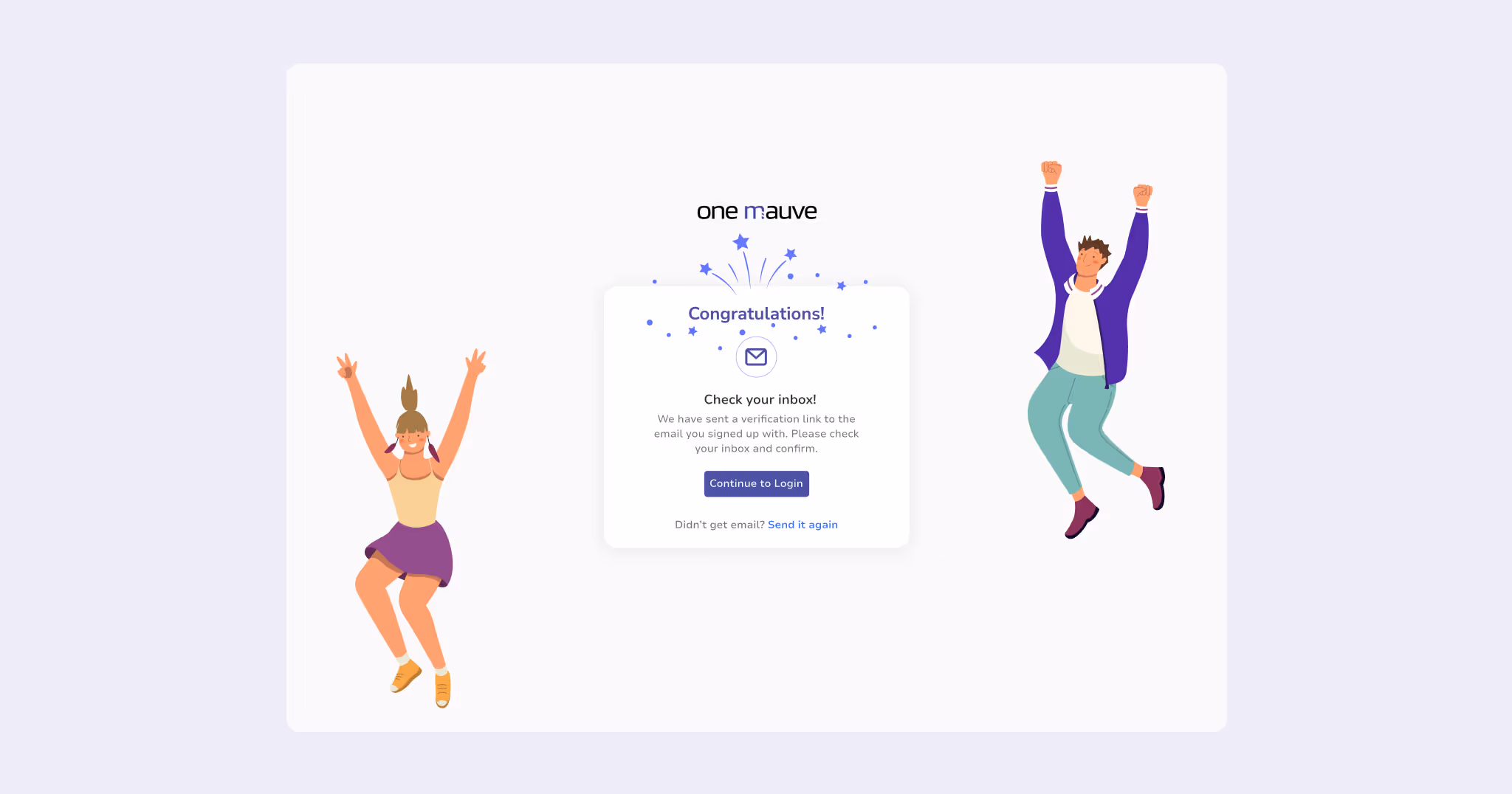
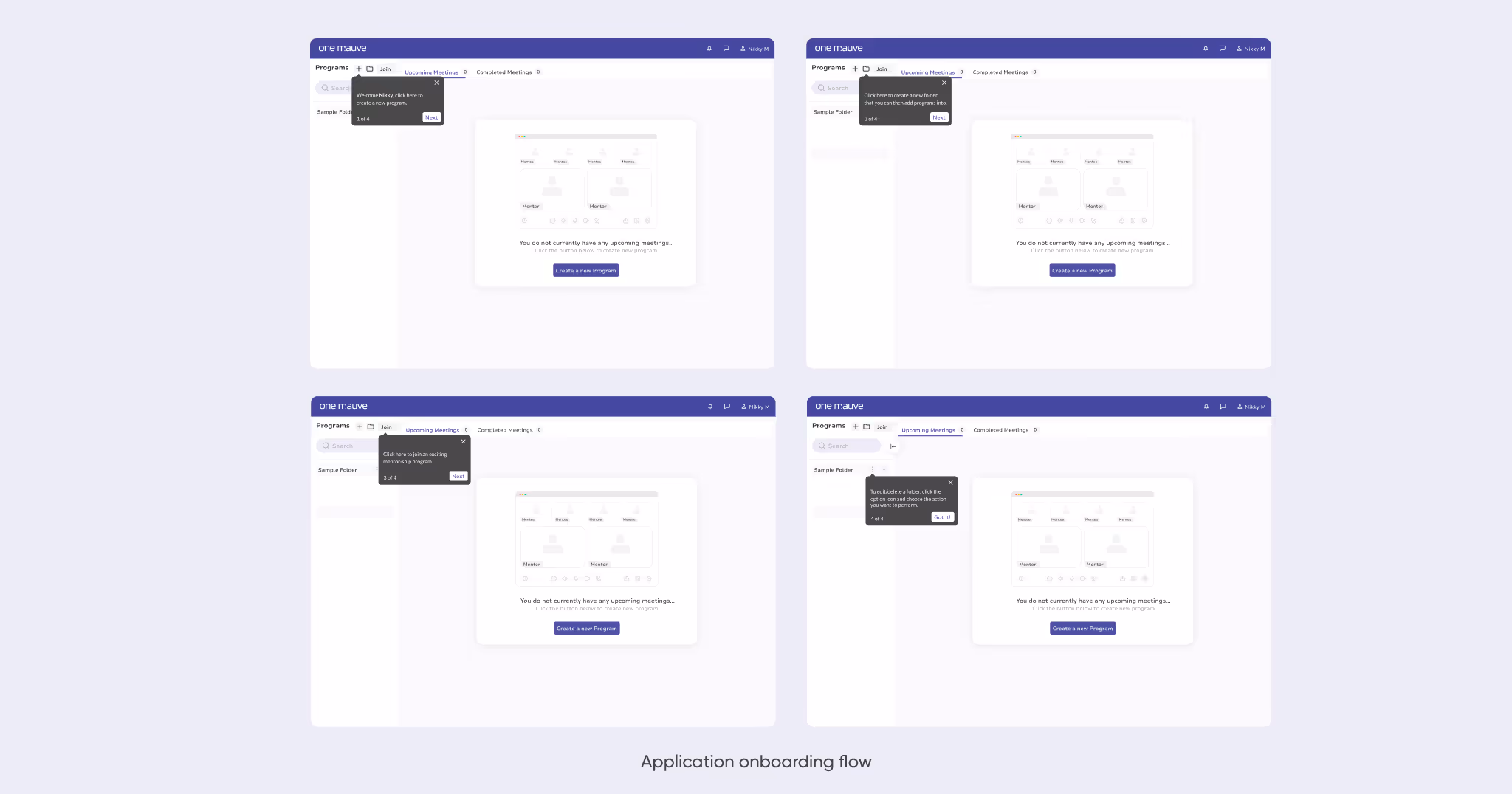
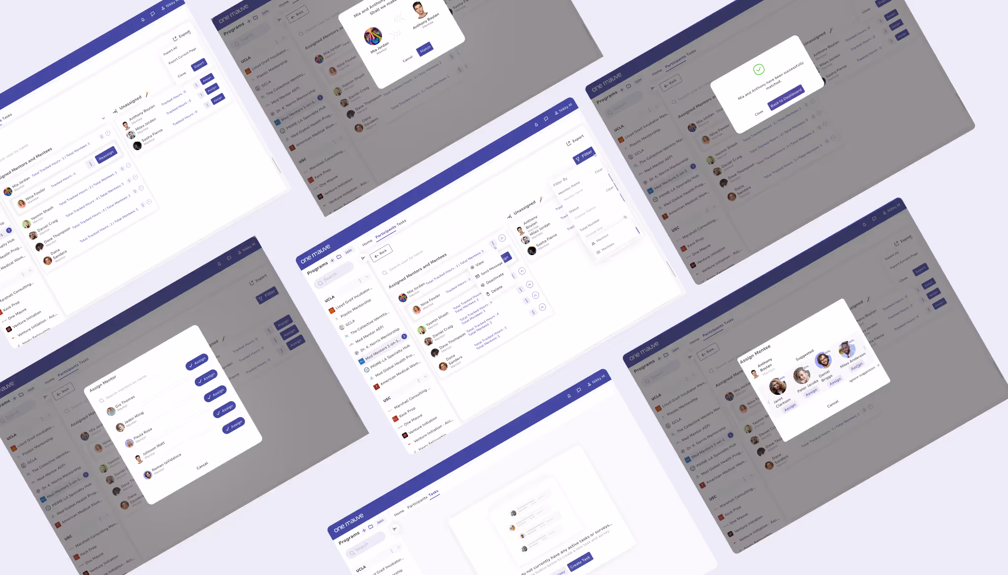
The first things we introduce and simplify was the onboarding process, it was the recurrent pattern (users’ feedback), they find it difficult as to what to do next. This we simplified with user-controlled guided messages, they can now onboard easily and use the app with less boredom.
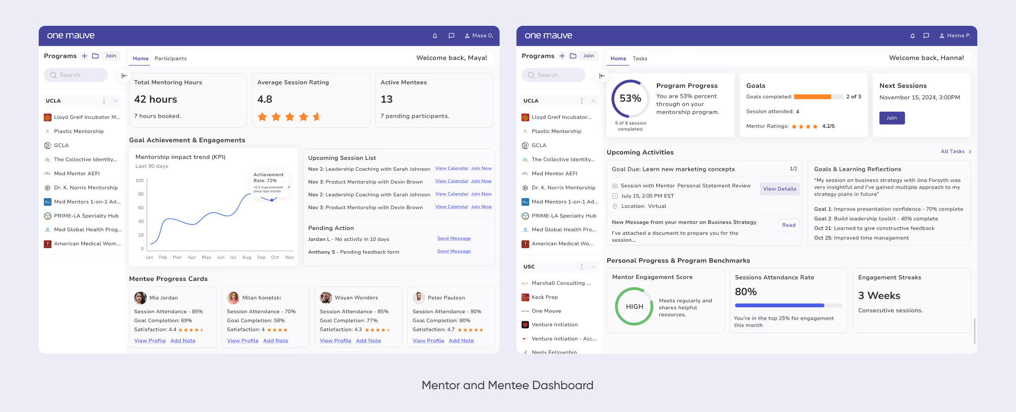
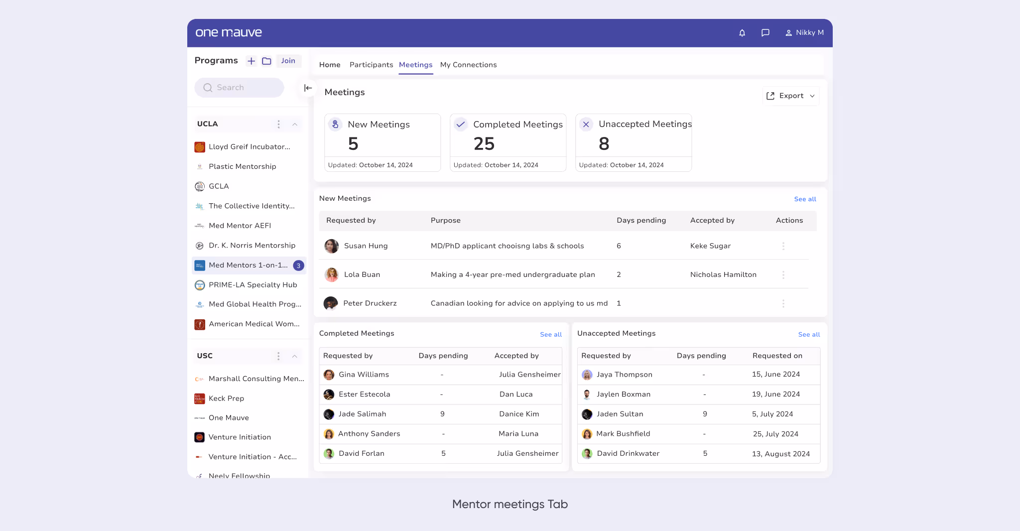
Another major design upgrade of the app was the mentor and mentee dashboard for personal metrics, progress and performance report which was mostly not available in the initial design. Now, participants can accurately monitor their own progress, see where they measure up or come up short for accountability and milestones.
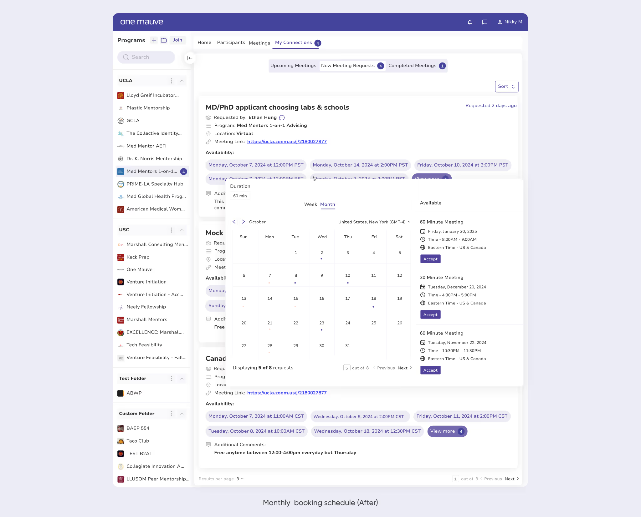
One of the core part of the application is its booking flow which was not clearly defined in the initial design, this caused lots of friction and clashed meetings where mentors were not available due to previous design logic flow.
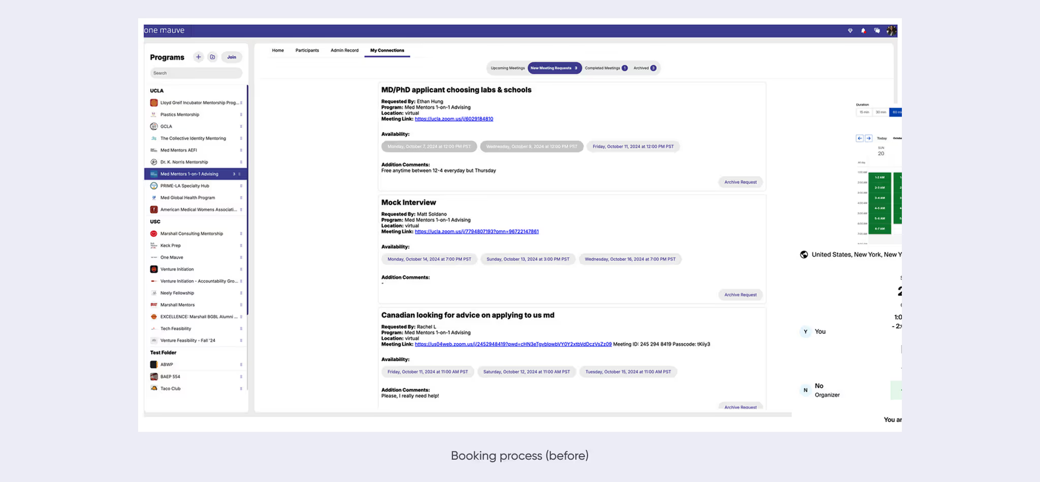
To ensure we maintain consistency and avoid cognitive load for the existing and new users, we kept the structure of the previous design. However, we introduced major UX changes to the booking flow especially the booking page, how meetings (pending and future) were displayed, future booking and mentor availability so mentees can fill these slots.
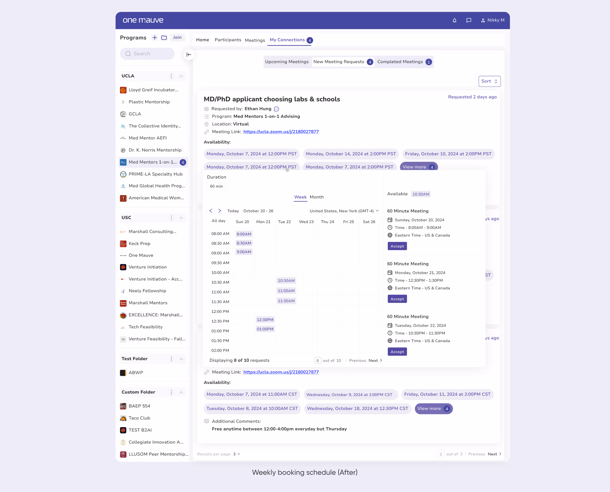
There was another issue of missed meetings due to late to non reminder on the users’ end. We added this feature to the upcoming meetings page for both users (using red text) which symbolise a critical event that needed urgent attention.
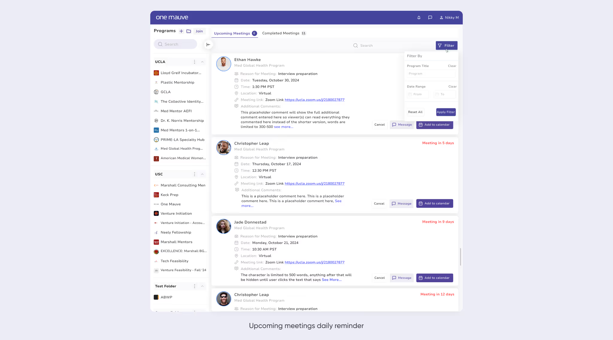
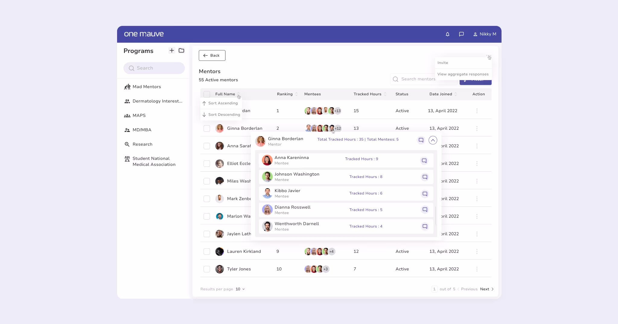
Mentors are also able to keep tabs on their meeting, the canceled, accepted and completed ones. They are able to preview the mentees and review their profile to see if they would like to mentor them or refer them to a more fitting mentor.
One of the core part of the application is its booking flow which was not clearly defined in the initial design, this caused lots of friction and clashed meetings where mentors were not available due to previous design logic flow.
The initial design of the app was more focused on the user which is important; however, no clear path for revenue generation for the business was defined. This was a major UX issue as mentors often decline meetings once they notice mentees (has had) 3 free meetings without subscription which has been handled in the current booking flow.
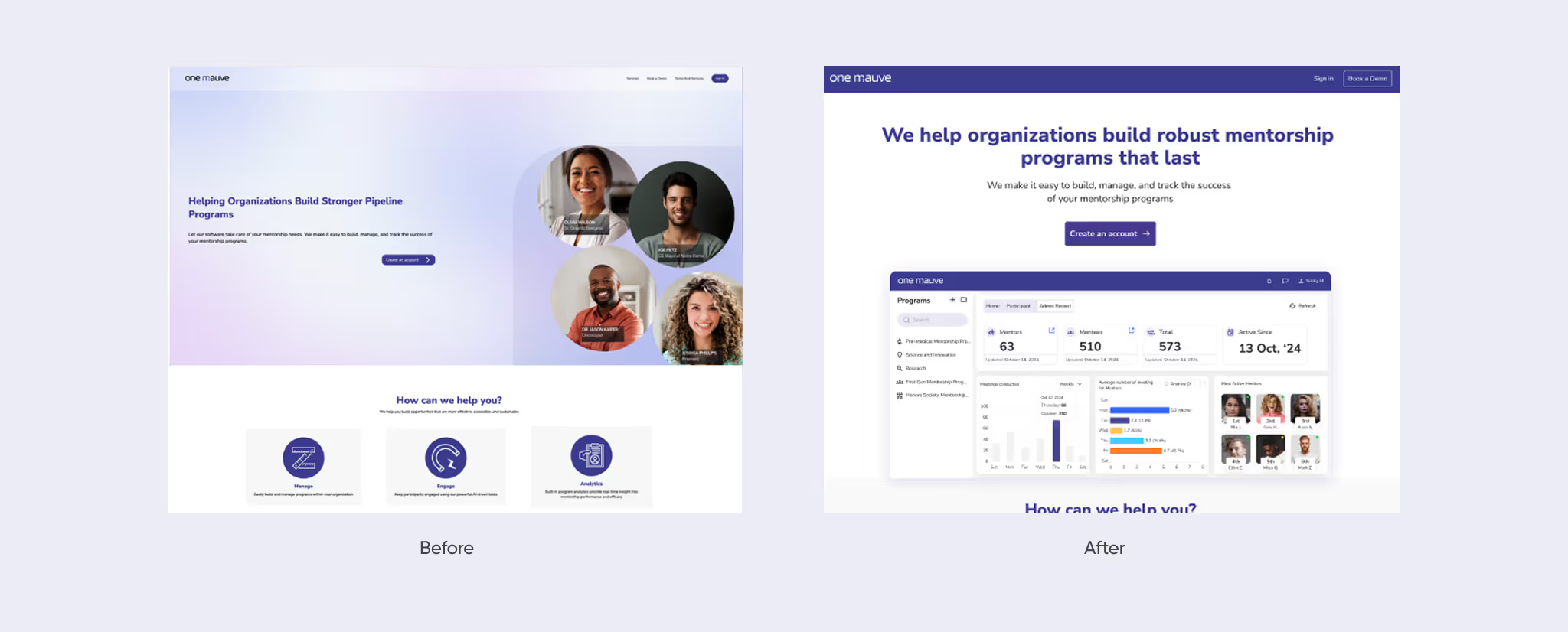
For a B2B app, the landing page main focus is to convert; as such, we pin-point the user-benefits using the app, the quick onboarding process and what they (business & individuals) stand to gain for using the app, this is to ensure we are human driven first.
Onemauve is a live project, the improved design was immediately moved to development stage for alpha and beta testing before final integration to the live app, we had few iterations based on business feedback, few participants on other metrics they would love to have.
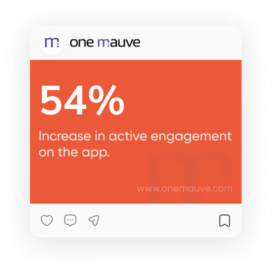
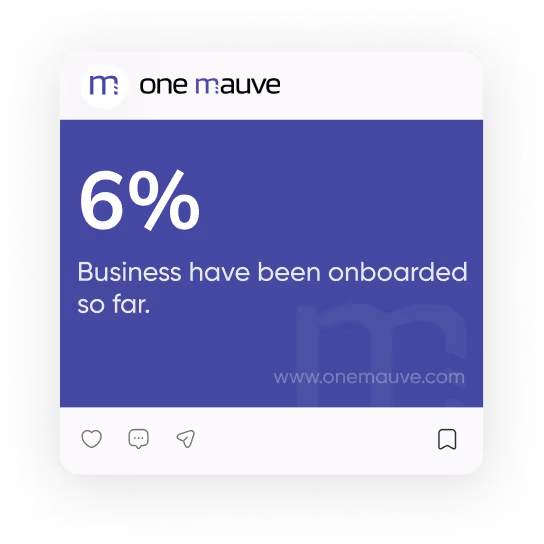
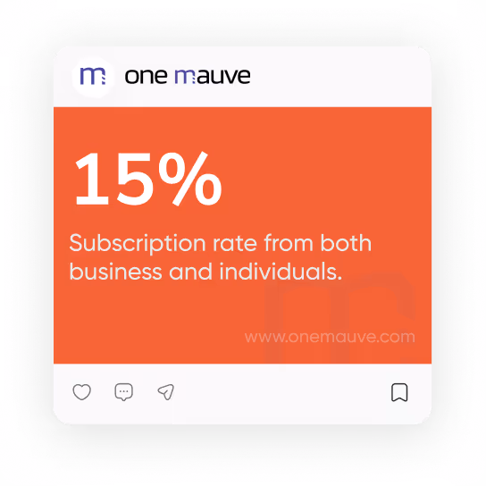
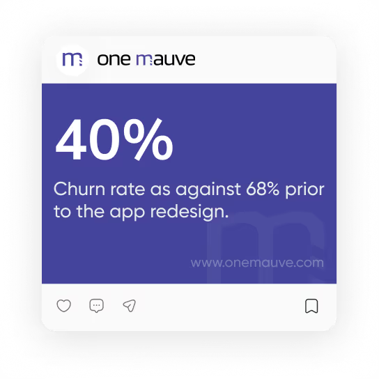
The project has went live early 2025 along with the landing page and we have recorded more positive engagements as listed below.
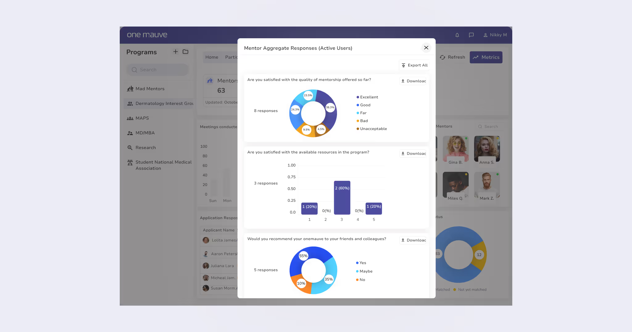
We are actively engaging our app users’ in survey via google form to get more feedback based on their engagement on the app so far; this way we can factor this into future integration.
Check out my other projects here: Case Study 👈