Designed to invoke strong purchase decision, remove purchase bias, guaranteed payment security (trusted payment brand icons), multiple purchase discount and 30% days refund policy
MagicResin is a brand that deals with premium products (Resin), used in the carpentry and other industries to beautify homes, furnitures, floors, table-tops and bars, arts, crafts amongst other artefacts. MagicResin is already doing well but want to improve their conversion rate (sales), brand consistency across all pages, optimise offering and get to wider audience within Canada which is their primary market.
There are other major producers within Canada and USA just like MagicResin; the brand wants to get better (user experience, reduce churn rate, increase customer trust and satisfaction) while capturing the lion share of the customer base which hasn’t been happening of late, “We have a conversion rate ~3.5% now and passing 4% would be amazing and I think we can get there since the current website is nice but not -that- nice!”
We were able to round up the design within 2 weeks of intense research, iteration, analysis and strategic decision were made to help ensure we touched the critical part of the website which will boost conversion from 3.5% to 12% by our projection and metrics based on the data we have prior to embarking on the project.
Designed to invoke strong purchase decision, remove purchase bias, guaranteed payment security (trusted payment brand icons), multiple purchase discount and 30% days refund policy
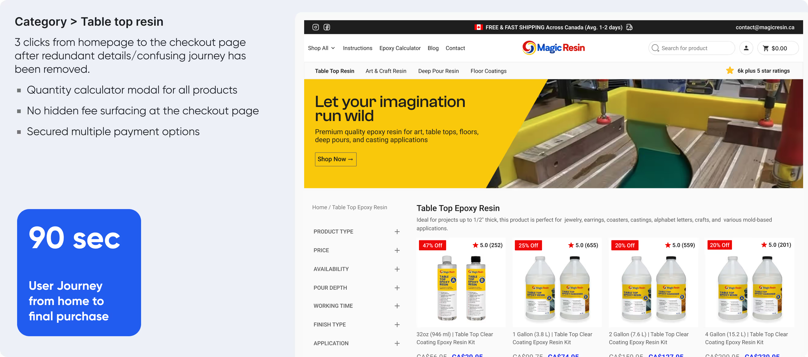
The journey from homepage to product page, comprehensive filter, cart and purchase page round off to 90 seconds after testing mockup prototype with 2 participants with less suggestion and guidance on my end to see how fast and easy a the navigate the website.
We achieved this by making a simplified inner navigation to the major products on the header which is consistent across all pages except checkout (to avoid distraction with primary action for the buyer is to make purchase and close the transaction) page.
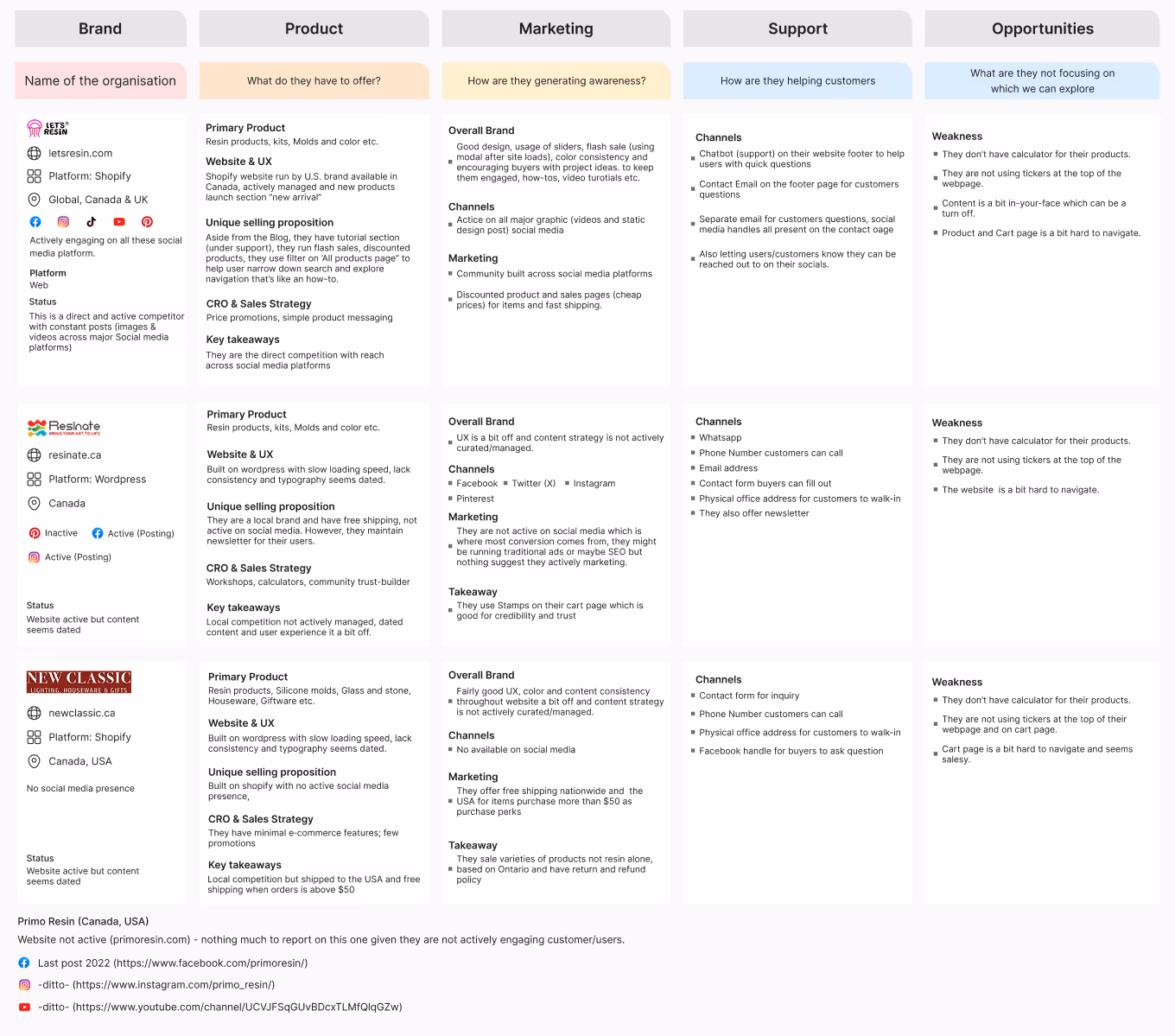
We carried out a robust competitor analysis to see what other resin brands are offering, their strength, weakness and opportunities we can explore to best positioned as the go-to resin brand in Canada.
We started with a sprint which I led after discussion over a zoom video call on what, where and how we can improve the present website.
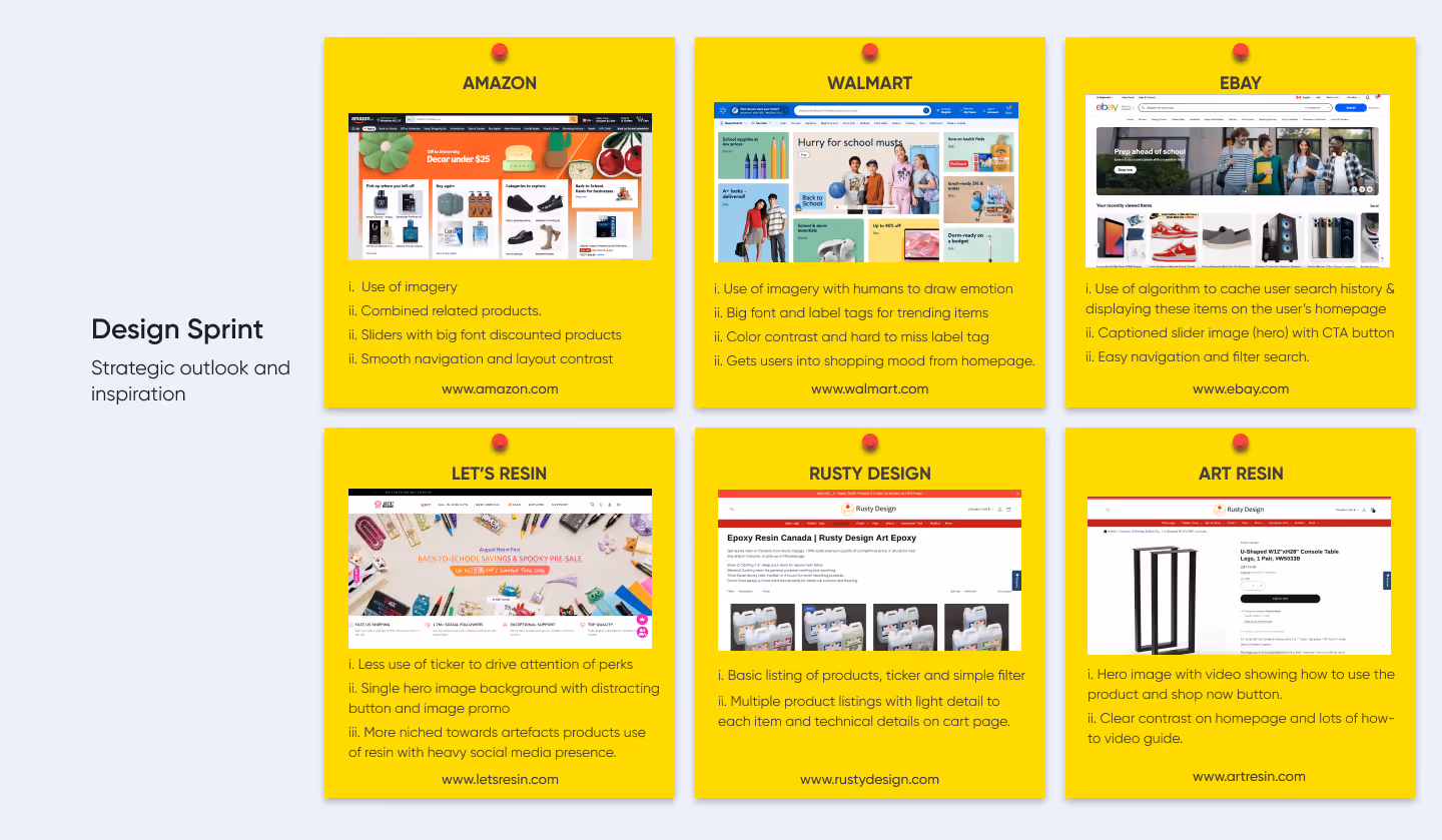
Drawing inspiration from the current big e-commerce brands on how they design their pages, user journey, ux and their conversion strategy. They are always iterating with massive data, metrics and years of research and development behind them which makes them relevant to date. We also look at what direct and indirect competitors are doing with their website to see if there’s a unique value proposition we can improve on to drive conversion for our brand.
We iterate with some ideas to help guide our design and conversion strategy to end the sprint. We were able to gather much needed information within 40 minutes for a robust conversion solution.
After the session we agreed on communicating benefits, instead of product feature, highlight pricing discount, show product and their utility on the homepage to help buyers make decision fast, brand consistency, contrast and clarity to help with information hierarchy which are UX principles and, centered around our existing and potential costumers.
After conducting holistic UX Audit of the website, a lot was discovered which is limiting conversion rate and a host of UX improvement to be done.
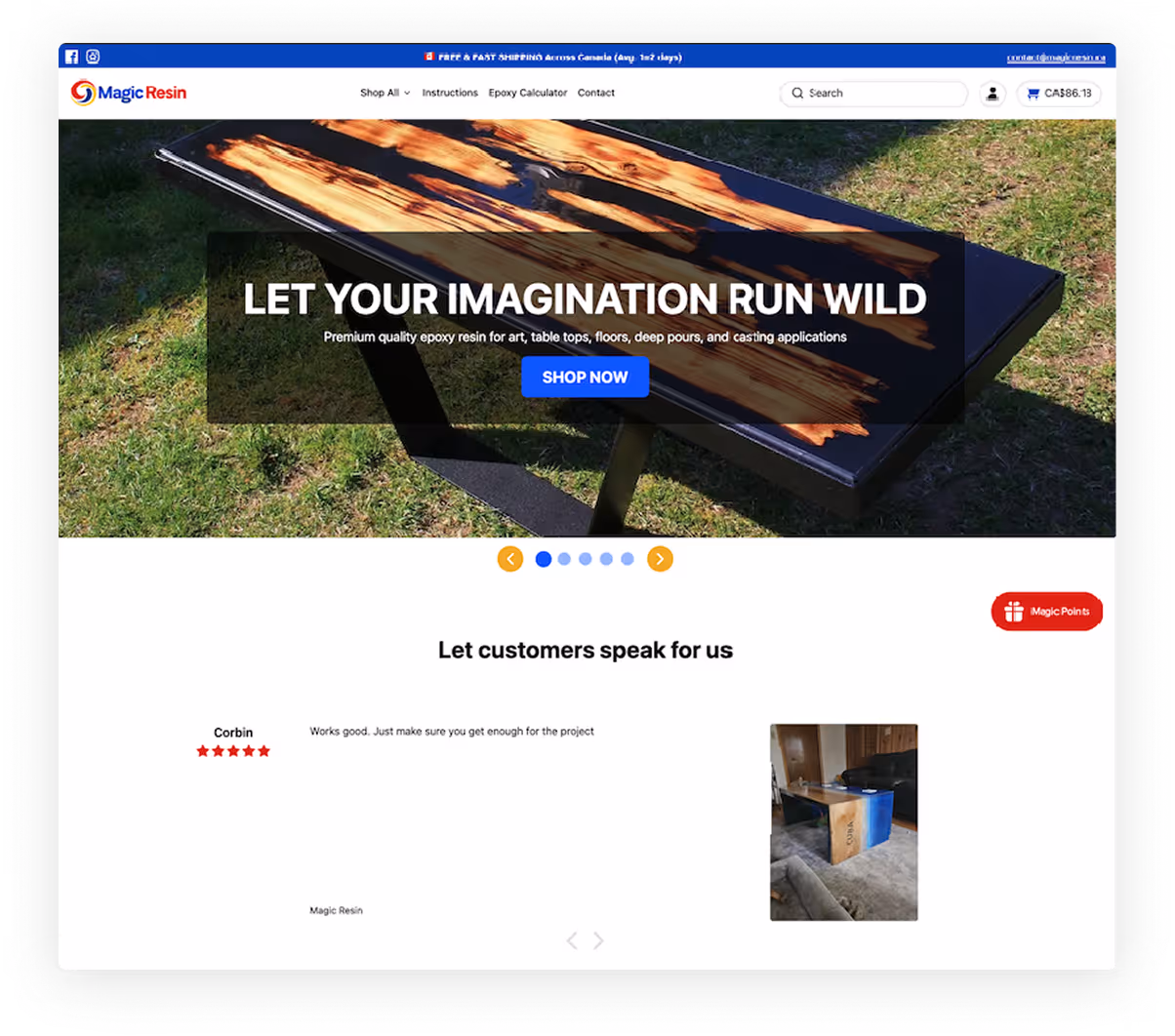
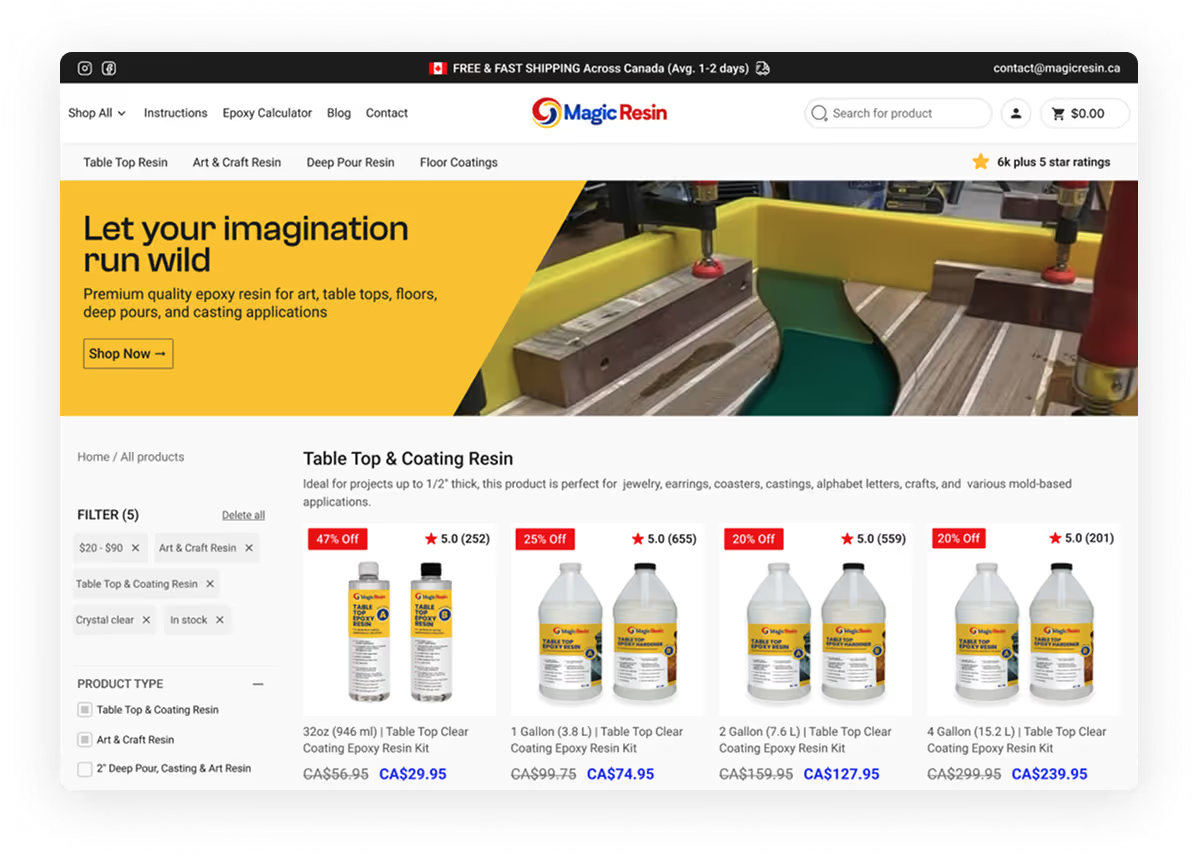
Before
Weak hero-section (navigation, ticker and slider), generic copy and button with unformatted social proof which may spook users from converting.
Clear copy of each major product, a clear call to action button, delivery perks and authentic social proof from existing buyers.
Product imagery and its utility to avoid keeping buyers guessing what they want to buy and for what purpose.
Usage of large font size for title and less large ones for subtitle to help with on-page SEO after development.
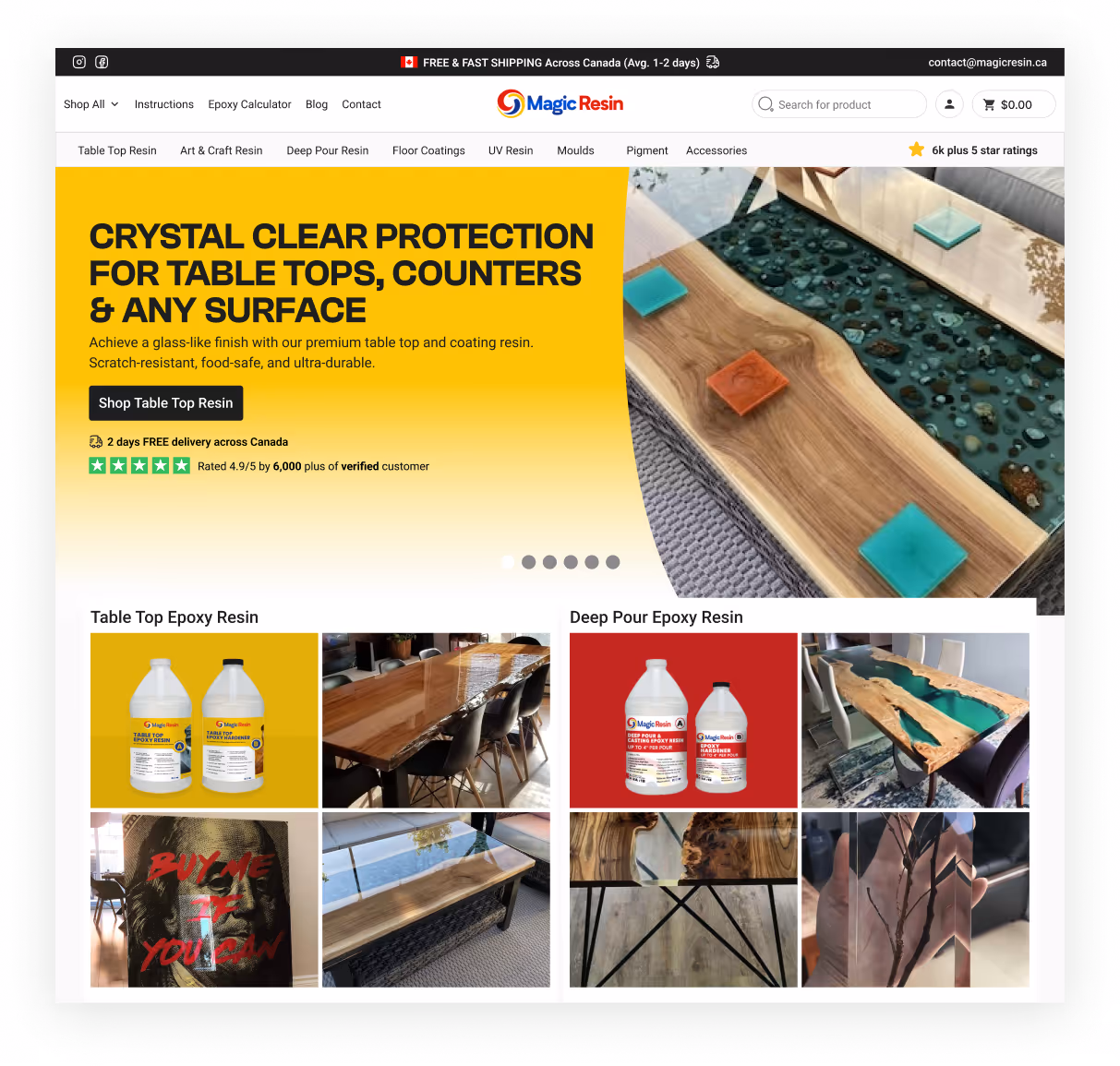
After
Before
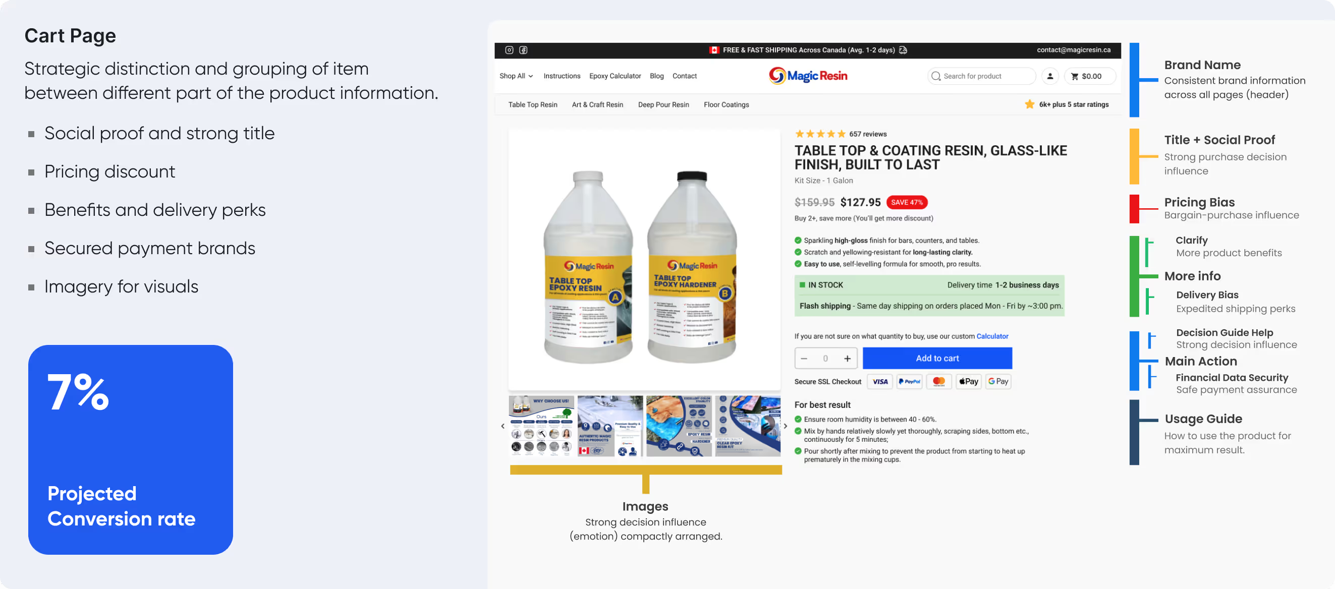
No clear message but usage of attention grabbing color to drive user eyes and make sales. Purchase bias is not addressed, review and payment seal social proof Few users read product description
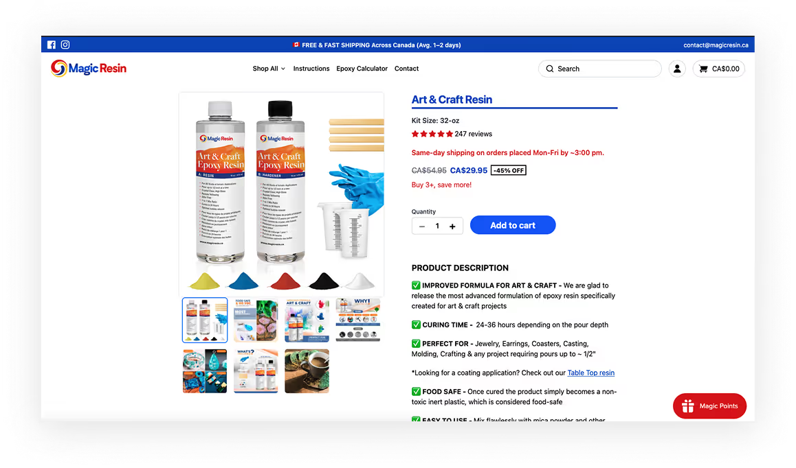
Convincing title copy and information hierarchy with distinct spacing between grouped item.
Product benefits, delivery perks and fast shipping incentive.
Secured checkout badge, custom calculator for buyer to allow them make decision and avoid buying more than they need. Again, usage guide for them to achieve optimal result from their purchase.
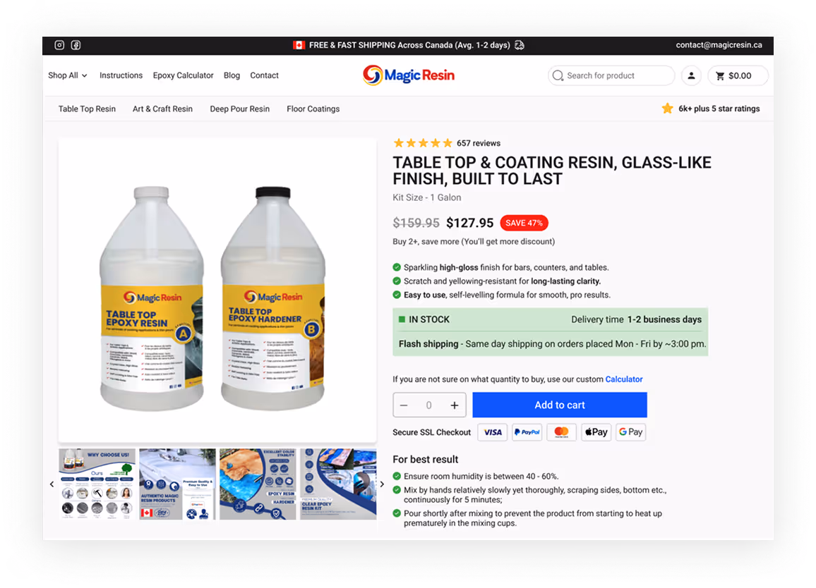
After
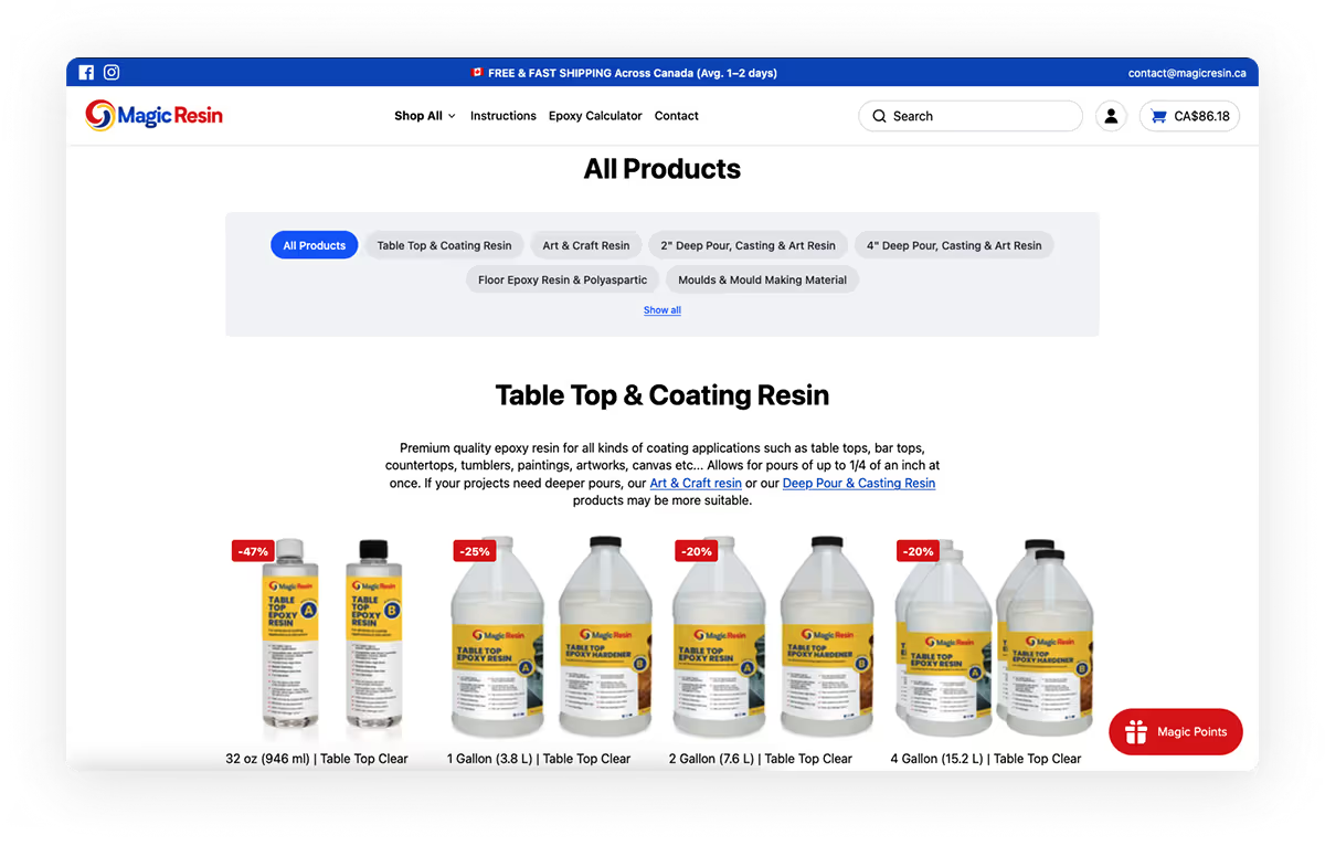
Before
The all product page which has listings of every product uses product item filter which does not give customers control on what they want and, at what price.
We were able to redesigned the entirety of this page, first is the introduction of detailed filter where search which gives buyers absolute control of pricing, details and sizes and what they want to use it for..
There is also a customised calculator link on the each product section to help them determine the quantity they’ll need to buy and save cost.
After
The result of our research, sprint and competitive research is a polished design, friendly copy and strategic use of contrast and imagery to guide visitors towards taking action as they say “one picture is worth more than a thousand word” the product application are there on the homepage with quality imagery to invoke emotion and turn visitors to customers with quality MagicResin products.
We leverage the brand social proof and ensure it’s prominent on the landing page as first impression matters a lot for buyers’ to know this is a trusted brand with thousands of unit shipped, good ratings, warm customer feedbacks with active social media (how-to guides, artists videos and brand promotional videos) presence.
Both users (managers and salespeople) embraced the product as we provided them with the visual (mockup) prototype of the product for end to end interaction while the design, research and asset files were handed over to the in-house software engineers for development.
The brand have a good SEO strategy in place both organic and sponsored; however, they stakeholders were advised to pay more attention to the video-driven social media (instagram, tiktok and facebook) which they are already safe tiktok which a big market on its own, this way we spend less on ads and drive traffic to the website through these digital footprints which increase the business revenue and cost ads cost significantly.
Major learning point for me throughout this project was annotating my thought process and key CRO (hotspots), this way, my design (Figma file) flows was easily readable and comprehensive as it had couple of eyes on it from the project owners and the developers’ team.
Check out my other projects here: Case Study 👈